In previous post we defined SXA grid system for a component and returned grid CSS classes in Sitecore Layout Service. In this tutorial we’ll use them in JSS application, so we can have a grid system configurable in Sitecore.
Last time we selected Bootstrap 4 for our grid system. Let’s quickly recap its major rules:
- Content should be placed within columns (elements with
.col-classes), and only columns may be immediate children of rows - Use rows to create horizontal groups of columns
- Rows (elements with
.rowclass) must be placed within a.containerclass element.
Very simple Bootstrap 4 grid may look like this (it contains one component inside a full width row and two components placed inside two columns on large screens, or stacked on mobile):

You can check all Bootstrap rules and constraints here.
In previous post we already allow to select .col- classes defined in SXA, inside our components rendering parameters, now we need another component, allowing authors to split the content into columns. Let’s start with rendering definition in Sitecore: create Json Rendering with ColumnSplitter in Component Name field and with column placeholder selected in Layout Service Placeholders field (this allows Sitecore Layout Service to return placeholder nested in component):
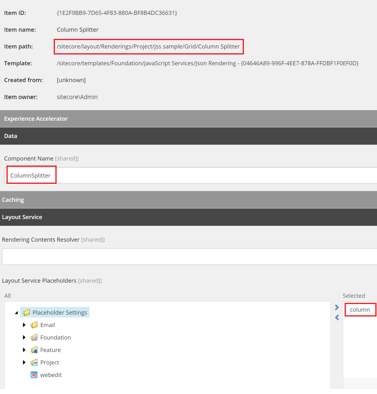 Definition of column placeholder is very straightforward:

We also have to add our new Column Splitter rendering to Allowed Controls in our main application placeholder settings (in this tutorial main placeholder name is content).
Let’s create now equivalent component in JSS. It contains only a row element with a column placeholder:
|
1 2 3 4 5 6 7 8 9 10 11 12 |
import React from 'react'; import { Placeholder} from '@sitecore-jss/sitecore-jss-react'; const ColumnSplitter = (props) => { return ( <div className="row"> <Placeholder name="column" rendering={props.rendering}></Placeholder> </div> ) }; export default ColumnSplitter; |
We need also to modify Layout.js to add .container element and Bootstrap.css reference:
|
1 2 3 4 5 6 7 8 9 10 11 12 13 14 15 16 17 18 19 20 21 22 23 24 25 26 27 28 29 30 31 32 33 34 35 |
import React from 'react'; import { Placeholder, VisitorIdentification } from '@sitecore-jss/sitecore-jss-react'; import { NavLink } from 'react-router-dom'; import { withTranslation } from 'react-i18next'; import Helmet from 'react-helmet'; import 'bootstrap/dist/css/bootstrap.css'; import './assets/app.scss'; ... const Layout = ({ route }) => ( <React.Fragment> <Helmet> <title> {(route.fields && route.fields.PageTitle && route.fields.PageTitle.value) || 'Page'} </title> </Helmet> <VisitorIdentification /> <Navigation /> <div className="container"> <Placeholder name="content" rendering={route} /> </div> </React.Fragment> ); export default Layout; |
We have now one additional component, which content authors will use to add other components inside the columns. We don’t want to complicate their lives more, when they want just to add full width component into the layout, they shall do it without extra steps.
Therefore we have to distinguish between components added into columns and those added directly to the main placeholder, so we can wrap them into a .row element. To address this, we need to return to JSS app the name of the placeholder, where the component was inserted. It can be achieved with a custom processor for renderJsonRendering pipeline, which will return placeholder name in additional property:
|
1 2 3 4 5 6 7 8 9 10 11 12 13 14 15 16 17 18 19 20 21 22 23 24 25 26 27 28 |
using Sitecore.Diagnostics; using Sitecore.LayoutService.Configuration; using Sitecore.LayoutService.Presentation.Pipelines.RenderJsonRendering; using Newtonsoft.Json.Linq; namespace SmartSitecore.Feature.GridRenderingParameters.Pipelines { /// <summary> /// Add placeholderName node to component rendering /// </summary> public class AddPlaceholderNameProcessor : BaseRenderJsonRendering { public AddPlaceholderNameProcessor(IConfiguration configuration) : base(configuration) { } protected override void SetResult(RenderJsonRenderingArgs args) { Assert.ArgumentNotNull(args, nameof(args)); Assert.IsNotNull(args.Result, "args.Result should not be null"); if (args.Result.RenderingParams != null) { args.Result.RenderingParams.Add("placeholderName", args.Rendering.Placeholder); } } } } |
We need to call this processor at the end of the pipeline, with following config patch:
|
1 2 3 4 5 6 7 8 9 10 11 12 13 14 15 |
<?xml version="1.0" encoding="utf-8" ?> <configuration xmlns:patch="http://www.sitecore.net/xmlconfig/"> <sitecore> <pipelines> <group groupName="layoutService"> <pipelines> <renderJsonRendering> <processor type="SmartSitecore.Feature.GridRenderingParameters.Pipelines.AddPlaceholderNameProcessor, SmartSitecore.Feature.GridRenderingParameters" resolve="true" /> </renderJsonRendering> </pipelines> </group> </pipelines> </sitecore> </configuration> |
If we call now Layout Service for our page, it shall return additional fields.placeholderName property:

Now we have all necessary data to use props.GridParameters in JSS component and implement the grid. We can create helper function:
- if placeholder name contains column add
.rowwrapper around the component. - add another wrapper which uses
GridParametersfor CSS class:
|
1 2 3 4 5 6 7 8 9 10 11 12 13 14 15 16 17 18 19 20 21 22 |
import React from 'react'; /** * Helper component that add bootstrap 4 grid wrapper. */ const ConditionalWrapper = ({ condition, wrapper, children }) => condition ? wrapper(children) : children; function withGrid(WrappedComponent){ return class extends React.Component { render() { return <ConditionalWrapper condition={(!this.props.params.placeholderName.includes("column"))} wrapper={children => <div className="row">{children}</div>}> <React.Fragment> <div className={this.props.params.GridParameters}> <WrappedComponent {...this.props} /> </div> </React.Fragment> </ConditionalWrapper> } } }; export default withGrid; |
We can use this helper in our JSS component:
|
1 2 3 4 5 6 7 8 9 10 11 12 13 14 |
import React from 'react'; import { Text, RichText } from '@sitecore-jss/sitecore-jss-react'; import withGrid from '../GridWrapper'; const ContentBlock = (props) => { return ( <React.Fragment> <Text tag="h2" className="display-4" field={props.fields.Title} /> <RichText className="contentDescription" field={props.fields.Content} /> </React.Fragment> ); } export default withGrid(ContentBlock); |
Usage
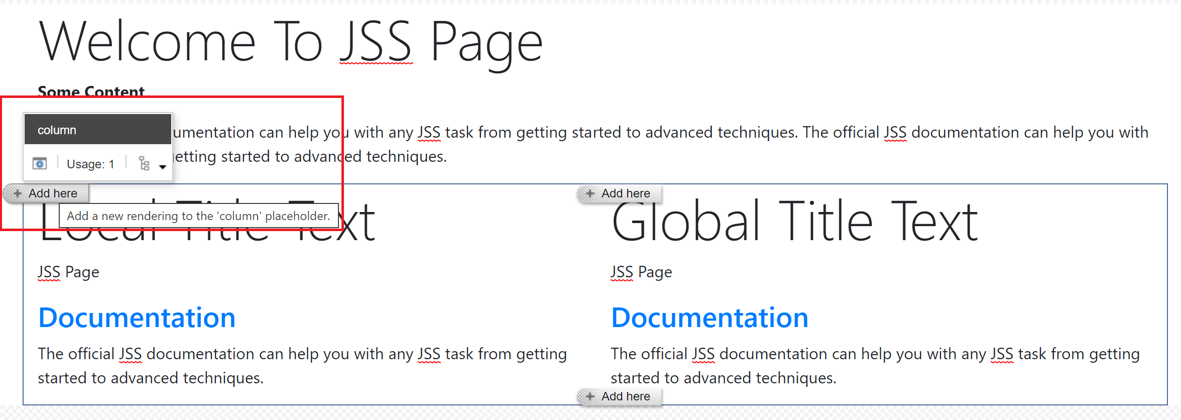
After deploying app to Sitecore we shall be able to edit the grid in Experience Editor. Add components to the placeholders:
And set grid for components (it’s possible with extra SXA button):

Let’s verify, if page is responsive on small screens, according to defined grid:
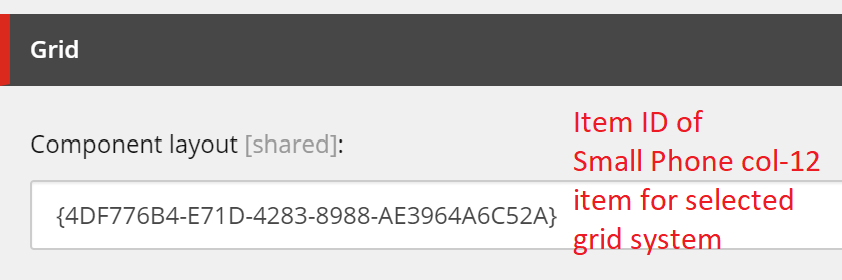
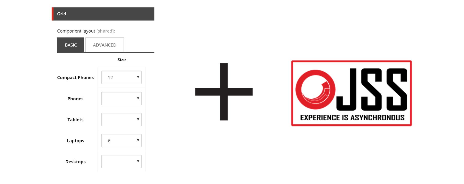
With Bootstrap every component added to the container needs .col- class. To make lives of content authors easier we can add default grid value (for example col-12 for every new component) in our rendering parameters item’s standard values. Because it’s a custom SXA field, it’s only possible when we displaying raw values in Sitecore: