
Create Banner Fields
- (Optional) use your theme with customised margins and styles.
- Add background image and remove all margins from Section.
- Add Card to the Section (will be used later to apply gradient).
- Add Block to the Card to layout the content to max width with padding.
- Add Card to the Block to layout fields to the center.
- Add Headline, Paragraph and Button to the Card.

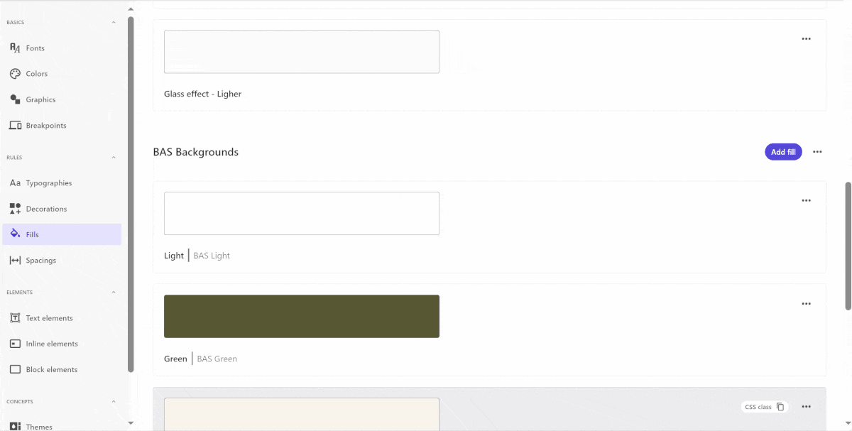
Add Gradient
- In Styles create new Fill with Gradient color inside the “Fills”.
- In Styles create new Card element with the Fill inside the “Block elements”.
- In Styles use new Card element in Theme.
- In Components use new Theme in Card inside the Section.
Add Component Variants
- Duplicate initial version.
- In new versions set alignment in top level Card and Block elements.
- Set max width in Card element inside Block.
- In new versions in Card inside Section use different Gradient style.

Add Mobile Version
- Duplicate initial version and apply breakpoints.
- Add new Section below initial Section and apply theme with mobile margins to it.
- Add new Block element to new Section.
- Move Card nested in old Block to new Block.
- Apply styles in Headline and Paragraph.
- Remove gradient style from Card and adjust size of initial Section.
